Memorial Sloan Kettering
Disease Guide Redesign
Redesigning complex cancer information around the needs of patients — creating a mobile-first experience that made critical information easier to understand and act on.
CASE STUDY
Rethinking how people navigate cancer information
Redesigning more than 1,000 pages of cancer information around the needs of patients and families — and creating a mobile-first system that could scale across 70+ cancer types.
Memorial Sloan Kettering Cancer Center
My Role: Associate Director, UX Design
Scope: UX Leadership · Experience Strategy · Mobile UX · Content Strategy · Research & Testing
Team: UX Design · Strategy · Content Strategy · Project Management · Technology + MSK stakeholders
Timeline: ~1 year
TL;DR
Memorial Sloan Kettering's Disease Guides serve 4.2 million visitors annually across more than 70 cancer types and 1,000 pages — but the experience was difficult to navigate, inconsistent across cancer types, and poorly suited to the 86% of MSK traffic coming from mobile devices.
As Associate Director of UX Design, I led at the UX team through a year-long redesign focused on organizing cancer information around what patients and families need at different stages of their journey.
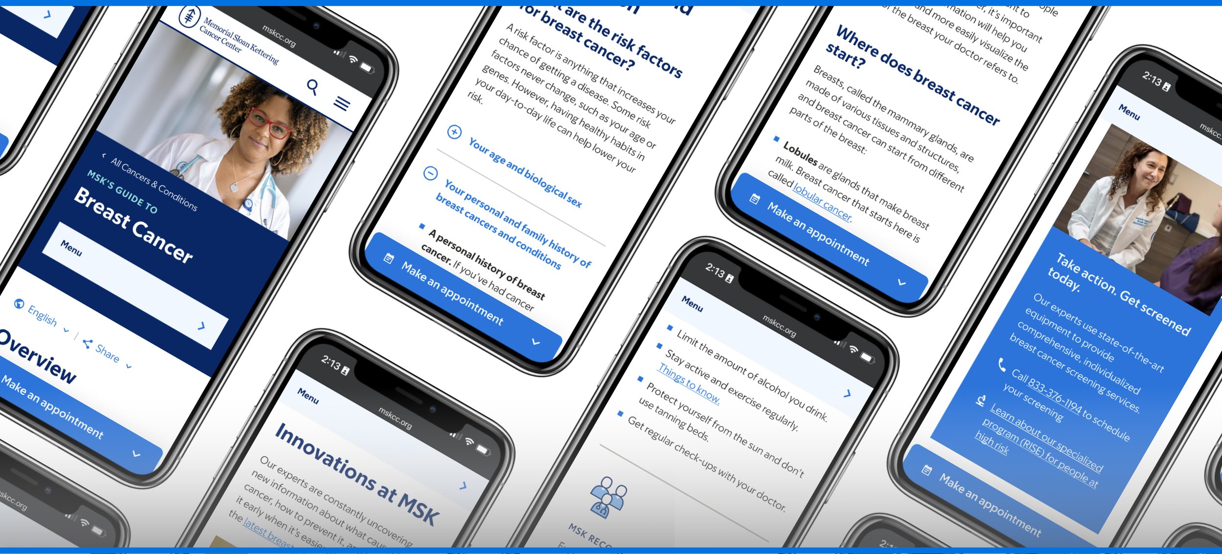
We redesigned the experience using a new content structure, chaptered navigation, reusable templates, and 10 new components that helped people understand complex information, know where they were, and determine what to do next.
We proved the new system with Breast Cancer, then worked with MSK's marketing and development teams to create a scalable implementation plan. Over the following two years, MSK rolled the new direction across its entire Disease Guide library.
View the new experience here
MY ROLE
UX Leadership · Experience Strategy · Research & Testing · Mobile UX
THE SCALE
4.2M annual visitors · 70+ cancer guides · 1,000+ pages · 86% mobile traffic
THE OUTCOME
A new mobile-first experience · 10 redesigned components · Scalable templates · Rolled out across all cancer types
“It’s well thought out. It’s well organized. And that’s what you need when your mind is going 100,000 miles an hour trying to figure out what to do next.”
Cancer information is complicated. Finding it shouldn't be.
Memorial Sloan Kettering has spent more than 130 years focused exclusively on cancer care, research, and education.
That expertise extends to MSKCC.org, where more than 70 Disease Guides and 1,000 pages of content help millions of people understand different cancers, diagnoses, treatments, and what comes next.
But the experience had accumulated problems over time.
Information wasn't consistently organized across cancer types. Navigation was difficult, particularly on mobile. Pages were long and dense. Calls to action weren't always clear. And the overall experience lacked humanity for a subject as personal and overwhelming as cancer.
This wasn't simply an information architecture problem.
People often arrive at these guides while thinking they might have cancer, waiting for a diagnosis, helping someone they love, evaluating treatment options, or recovering from treatment.
We needed to design around those moments.
4.2M
Annual Disease Guide visitors
1,000+
Pages of cancer information
86%
MSK website traffic on mobile
The opportunity was huge.
The Disease Guides attracted approximately 4.2 million visitors annually, but very few were taking the next step toward receiving care at MSK.
Only 0.14% of Disease Guide traffic ultimately became MSK patients.
That didn't mean every visitor should become a patient. Many people simply needed trusted information.
But for people who were looking for care, the experience wasn't doing enough to help them understand what to do next.
Walls of text, inconsistent navigation, unclear calls to action, and an experience designed largely around the information itself made an already difficult situation harder to navigate.
The challenge became:
“
How might we organize MSK's enormous body of cancer expertise around what people need at different moments in their cancer journey?
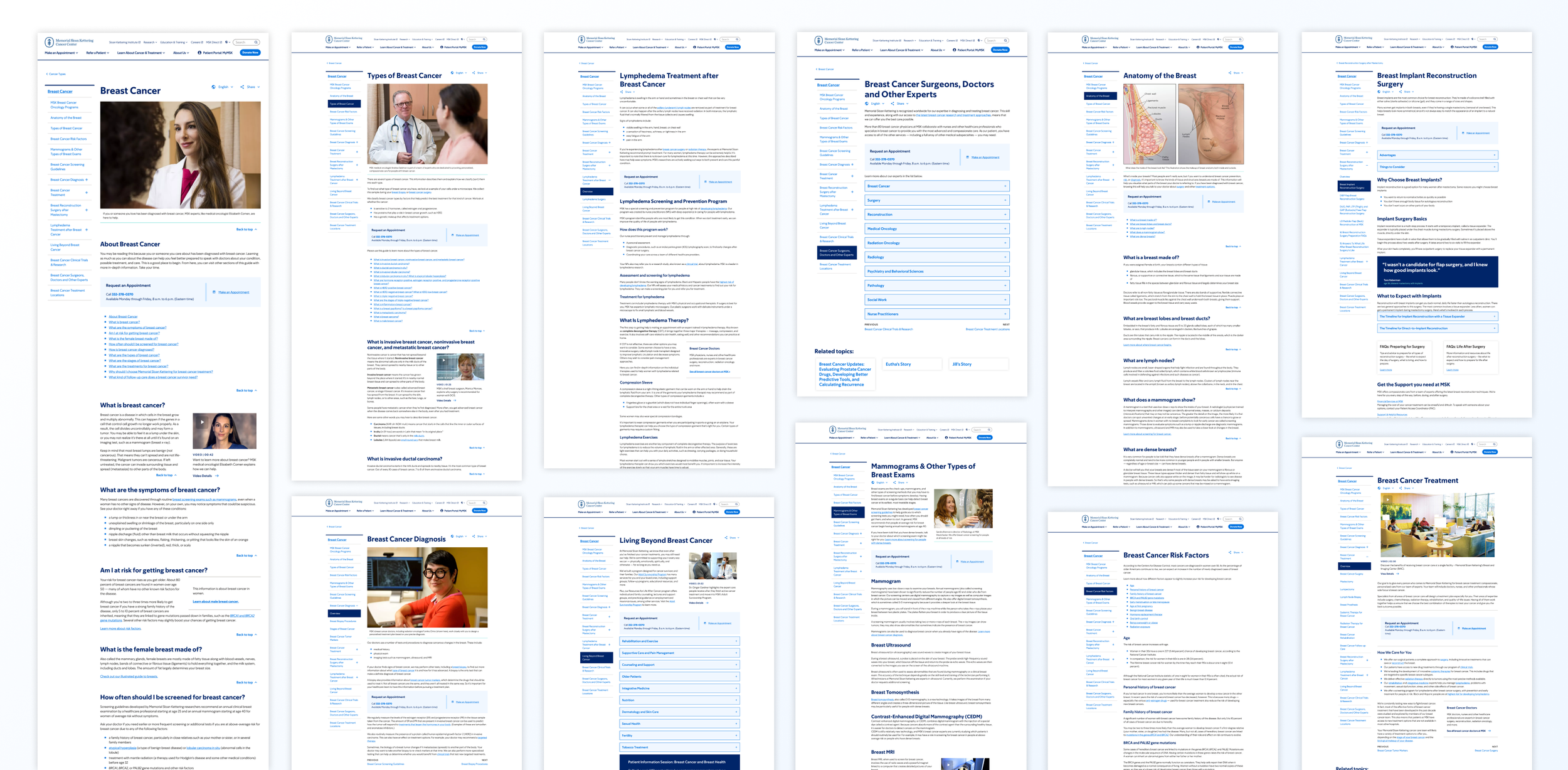
Previous experience screenshots
We started with people, not pages.
Before redesigning the guides, we needed to understand the experience surrounding them.
Strategy work preceding the design phase had identified the Disease Guides as one of MSK's largest opportunities to better serve potential patients and people recently diagnosed with cancer.
The team combined analytics, stakeholder interviews, conversations with cancer experts, and competitive research with interviews involving people who had experienced cancer personally or through a family member.
We deliberately recruited across genders and a broad range of ages, from people in their 20s through their 70s.
We later brought participants back to test our assumptions using prototypes.
The research reinforced something important
There isn't one cancer-information journey.
A person wondering whether a symptom could be cancer is looking for answers and reassurance.
Someone who has just been diagnosed needs to understand what comes next.
And someone evaluating treatment or moving into recovery has an entirely different set of questions, decisions, and needs.
The experience had to support people wherever they were in that journey.
We began organizing the experience around those changing needs rather than expecting people to understand MSK's internal content structure.
Mapping the cancer journey
We mapped the lifecycle of prospective patients from the earliest stages of seeking information through diagnosis, treatment, continued care, and recovery.
That helped us think about every page in two ways:
What does this person need to understand right now?
and
What might they need to do next?
That distinction became fundamental to the new experience.
Instead of treating the Disease Guides as a collection of encyclopedia pages, we began treating them as a system that could help orient people through an incredibly complicated journey.
My role was to connect the strategy to the experience.
As Associate Director of UX Design, I led the UX discipline throughout the project.
Our UX team included a UX Design Lead and two Senior Designers. I partnered closely with a Senior Strategist and Senior Content Strategist, along with project management and technology.
I led workshops to help the team understand the landscape, evaluate best-in-class experiences, prioritize problems, map patient lifecycles, and understand how prospective patients moved into MSK's care system.
Throughout the project, I helped establish the UX direction, assigned and reviewed design work, designed portions of the experience myself — including navigation — presented recommendations to stakeholders, and led UX testing.
Because we were an external team working remotely with a complex healthcare organization, another significant part of the job was alignment.
MSK leadership, marketing, brand, product, engineering, subject-matter experts, and other stakeholders all had legitimate perspectives on the experience.
The challenge was turning those perspectives into a coherent product rather than a collection of requirements.
Designing for orientation
Design Decision 01
Disease Guide pages could become extremely long. And because different cancers have different types, stages, treatments, and care paths, a rigid information structure wasn't going to work.
The new experience needed enough consistency that someone could learn how a Disease Guide worked, while remaining flexible enough to accommodate the differences between breast cancer, lung cancer, blood cancers, and dozens of others.
One problem appeared repeatedly as the content architecture evolved:
How do you help someone know where they are inside 1,000 pages of cancer information?
Create a chaptered navigation system.
We designed navigation that gave visitors a clearer sense of where they were within the larger guide and allowed them to move between major topics without forcing them through a linear experience.
Navigation became more than a way to move between pages.
It became a wayfinding system.
Designing for understanding
Design Decision 02
The existing experience often relied on long passages of text to explain complicated topics.
But cancer information doesn't necessarily become more useful simply because you provide more of it.
We explored ways to layer information so visitors could understand the essentials first and choose when they wanted greater depth.
Let people control how much information they need.
Content drawers and progressive disclosure patterns allowed us to reduce the visual weight of complex pages without eliminating the depth and clinical information that made MSK's content valuable.
Interactive elements and illustrations could also help explain concepts that were difficult to communicate through text alone.
The challenge was ensuring these ideas could scale.
Creating one sophisticated illustration for Breast Cancer was relatively straightforward. Creating and maintaining equivalent experiences across more than 70 cancer types was an entirely different proposition.
Every component therefore had to balance:
Usefulness × Flexibility × Scalability
Designing for action
Design Decision 03
Another opportunity emerged from thinking about the guides as part of a larger patient journey.
People weren't only trying to learn.
Sometimes they needed help figuring out what to ask, where to go, or whether it was time to seek care.
Help people turn information into better conversations.
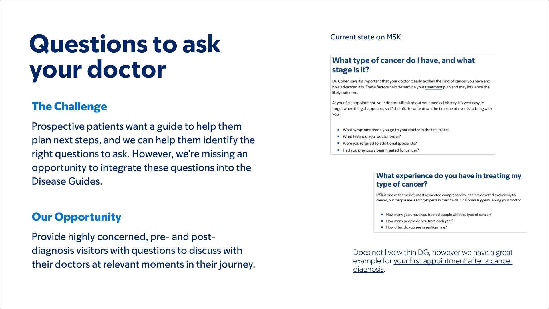
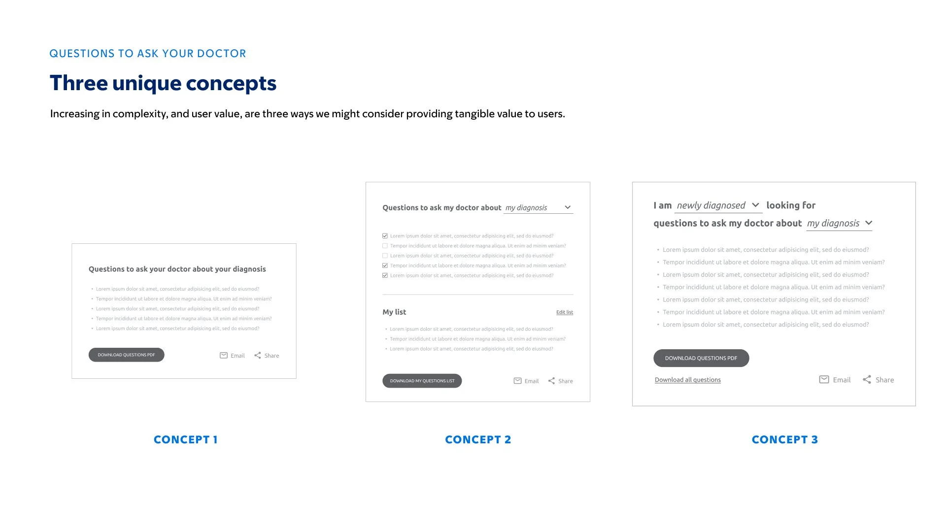
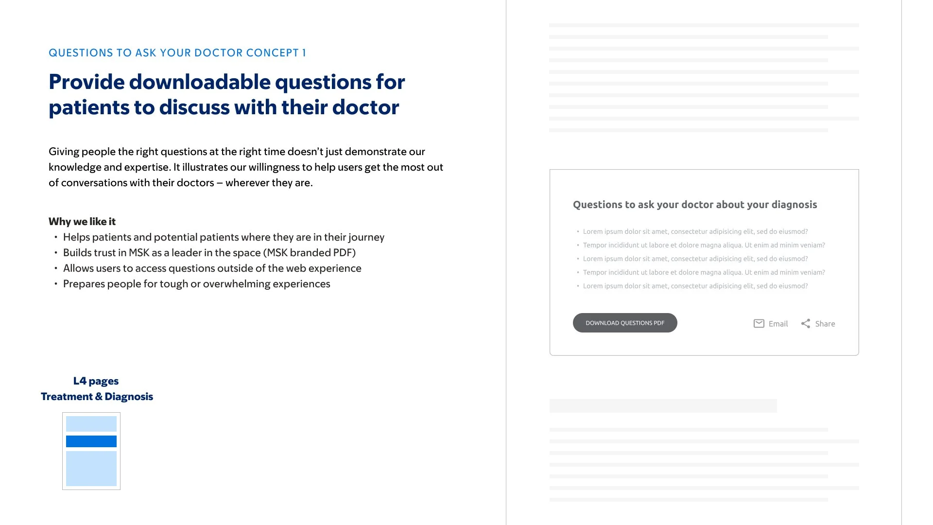
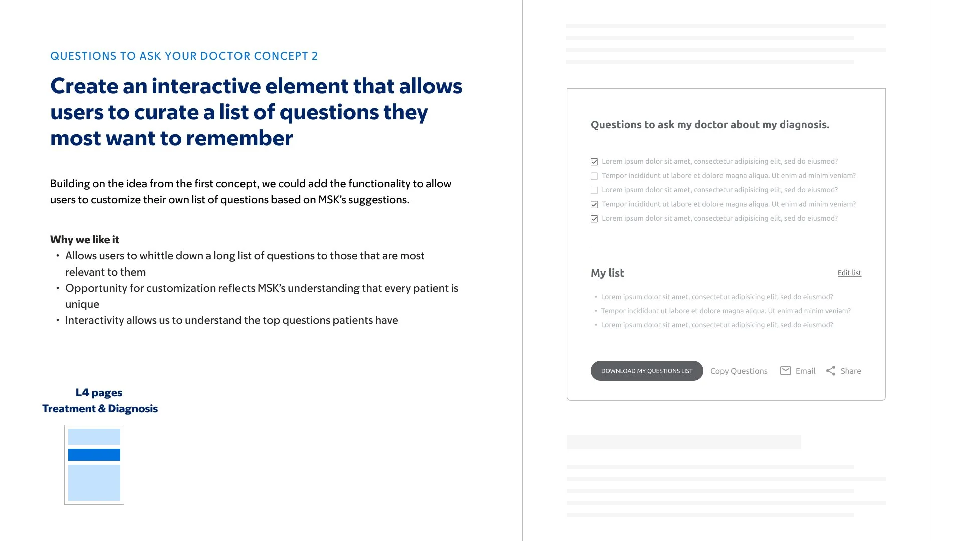
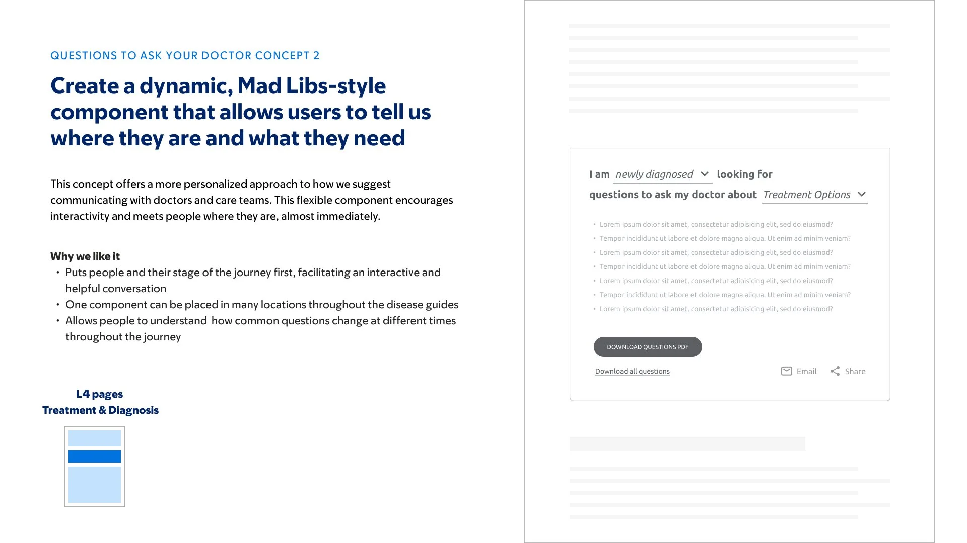
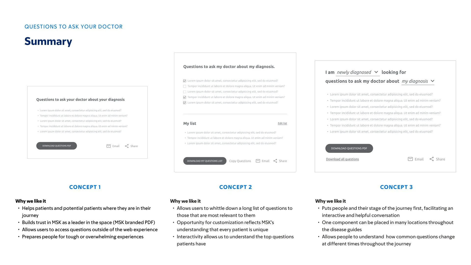
We created a Questions to Ask Your Doctor experience that surfaced relevant questions depending on where someone was in their cancer journey.
Visitors could explore questions while reading and save the ones that mattered to them.
The goal wasn't simply to increase engagement.
It was to make the information more useful when someone left the website.

Designing a clearer path to care
We also needed to acknowledge that some visitors weren't simply researching cancer.
They were actively looking for treatment.
The previous experience often left that next step unclear.
We introduced components including Reasons to Believe, patient testimonials, clearer calls to action, and an appointment experience designed to help people understand why MSK might be right for them and how to take the next step.
The intent wasn't to turn sensitive health information into a sales funnel.
It was to make the path forward clear when someone was ready for care.
One cancer guide had to prove the system.
We chose Breast Cancer as the first complete implementation.
It is one of the most common cancer diagnoses and contains many of the complexities the larger system would eventually need to accommodate: multiple cancer types, stages, treatment paths, and continued-care needs.
That made it an ideal stress test.
If the system could accommodate the complexity of Breast Cancer, we would have a much stronger foundation for scaling it across MSK's other Disease Guides.
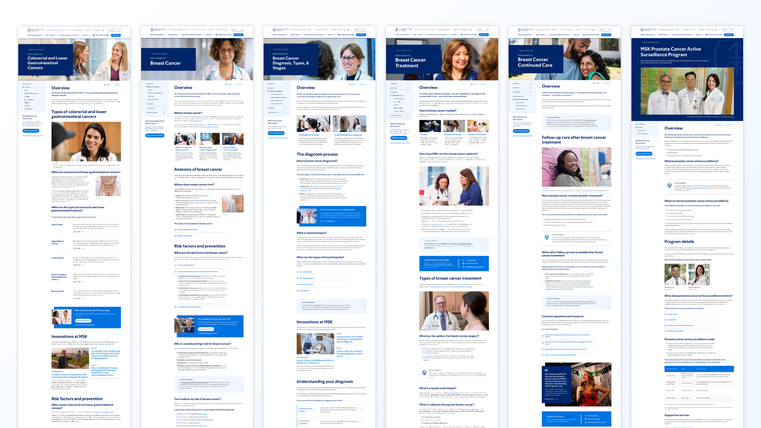
The final experience combined reusable page templates with a library of new components, including:
Chaptered Navigation
Helping visitors understand where they are.
Content Drawers
Making detailed information easier to explore.
Questions to Ask Your Doctor
Turning information into useful conversations.
Appointment Experience
Creating a clearer path toward care.
These weren't simply UI components.
Together, they created a new vocabulary for how MSK could structure cancer information.
Getting there required changing more than the interface.
Some of the hardest constraints weren't visual.
The existing engineering organization understandably wanted to preserve portions of the site's underlying structure. Changing those systems across more than 1,000 pages represented significant development effort.
Rather than treating that as a battle between design and engineering, we used prototypes and user feedback to make the value of proposed changes tangible.
Showing how people struggled with the existing patterns — and how they responded to new ones — gave the team evidence for deciding where additional engineering investment was justified.
The collaboration ultimately became an important part of getting the experience across the finish line.
Testing the system, not just the screens
We returned to participants from our research to validate the emerging experience through prototypes.
Testing helped us refine details such as information drawers, chaptered navigation, and the flow for saving questions to ask a doctor.
But just as importantly, it gave the broader team evidence that the larger direction was working.
The goal wasn't to use research as a final approval step.
It was to use it throughout the process to reduce uncertainty, improve the experience, and help a large organization make difficult decisions with greater confidence.
VISUAL: EARLY PROTOTYPE → TESTING INSIGHT → REFINED EXPERIENCE
Designing the rollout
4 delivery sprints
Reusable templates
Handing MSK hundreds of finished screens wouldn't have solved the larger problem.
The system needed to be implementable.
We organized final delivery into four sprints, focusing each sprint on a small number of templates and components.
After each delivery, we met directly with MSK's developers and product managers to walk through the work, answer questions, and clarify interaction and content behavior.
That created a much tighter bridge between the intended experience and what would eventually ship.
10 new experience components
One scalable system
Breast Cancer was the beginning.
MSK launched the redesigned Breast Cancer Disease Guide first.
From there, the organization prioritized additional guides based on traffic and the prevalence of each cancer type.
Over the following two years, MSK rolled the new direction and templates across its full library of cancer guides.
70+
Cancer types eventually migrated
1,000+
Pages supported by the new direction
10
New reusable components
The project had moved from redesigning a guide to changing how one of the world's leading cancer centers organized and presented cancer information online.
We also designed a way to keep learning.
The launch wasn't intended to be the end of the project.
Before handoff, we created a measurement framework that allowed MSK to evaluate how the Disease Guides were performing and continue improving them.
We organized success around three goals.
Goal: Make Disease Guides easier to find and access.
We proposed tracking traffic volume and acquisition channels to understand how people were discovering the guides and which content was attracting visitors.
Discoverability
Goal: Help visitors find and consume the information most relevant to them.
Depending on the guide and stage of the journey, measures included navigation deeper into the Disease Guides, CTA engagement, scroll depth, time on site, and movement between sections.
Engagement
Goal: Make the next step clear when someone is ready for care.
For higher-intent sections — particularly Diagnosis, Treatment, and Continued Care — we focused on movement toward the appointment experience, CTA engagement, leads, and completed appointment requests.
Conversion
The measurement strategy also reflected the journey itself.
Rather than expecting every page to accomplish the same business goal, we defined success based on what visitors were likely trying to accomplish at that moment.
Category & Overview Pages
Deepen engagement
Diagnosis Pages
Help people understand treatment and next steps
Treatment & Continued Care Pages
Make access to care clear
What I'm most proud of
There are projects where you're proud of the product.
On this one, I'm just as proud of the people who made it.
I had the opportunity to work with an exceptional group of strategists, content strategists, designers, technologists, healthcare experts, and MSK stakeholders who cared deeply about the people using these guides.
Cancer is an overwhelming subject. We weren't going to make that reality simple.
But we could make finding trustworthy information a little less overwhelming. We could help someone understand where they were, find what mattered, know what to ask, and see what they could do next.
It felt good to work on something where those small improvements could matter at a moment when people genuinely needed them.